The following chart shows the rolling 10 year returns of small cap value versus large cap growth. Red columns mark periods where the prior 10 years favored large cap growth. The chart shows that small caps have tended to outperform far more frequently. This year was shaping up to be the first time ever that small caps experienced 4 consecutive rolling 10-year periods of under-performance versus large growth in a row until small cap value finally breached into positive territory during the 3rd quarter 2017 (what a mouthful).
We stressed this in prior newsletters, but we don’t feel we have stressed it enough. The recent trend is very unique and, if history is any guide, the coming years could greatly favor small cap value. On the chart, take a look at the period following the internet bubble, starting in 2001. Small value outperformed large growth for 13 straight rolling 10-year periods in a row.
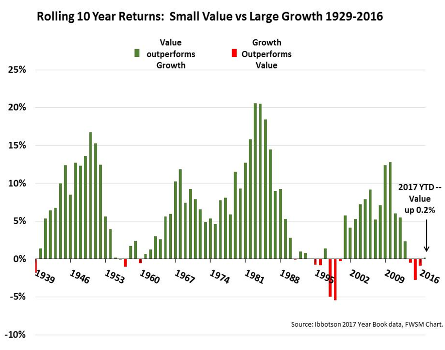
That is a massive, life changing level of out-performance. We don’t expect this magnitude of out-performance in the coming period, since valuations are not as discounted as they were during the internet bubble, but we do feel the winds should remain strongly in our favor in the coming years.